Posts

Showing posts from 2017

Sketchbook #8: Magazine Recreated

Image

Assignment #19: It's So Surreal

Image
Title: It's a Virtual Reality What is the difference between real and surreal?             Real means that it looks real and it actually is. As in it is tangible and an actual thing. Something that is surreal looks real but is not. What does it mean when someone says "It's so SURREAL!"             I, honestly, do not know. I think it is just another form of saying something along the lines of "that's so cool" or "no way!".  Surreal Photo (that's not mine #1) This is   Erik Johansson's photo. I don't know the title. But I really like it because of the concept. I like the idea that we could just paint a place we wanted to go and step through it. This photo came from an article and I read through it to see how it was put together... and he was committed. There was a lot that he put into this. The lighting is also really nice and it transitions from the living room to the grasslands really well. I think this p

Assignment #16: Yo Paparazzi

Image
Here it is! (Finally)

Assignment #18: Aaron Siskind

Image
Shutter: 1/320 ISO: 100 F/stop: 13 Shutter: 1/320 ISO: 100 F/stop: 8 Shutter: 1/320 ISO: 200 F/stop: 8 When looking at Aaron Siskind's work, I am fascinated with the clarity and light of his texture photos. His photos have a lot of shadows but is overall very light. And those are the things that I tried to incorporate in my photos. All of the photos have shadows and I edited them to make them look light. They are all texture based because I am very into these kinds of pictures. 

Sketchbook #7: Symmetry

Image

Sketchbook #6: Study of Seashells

Image

Assignment #17: Text

Image
Picture:  Transparent Background:

Assignment #15: Light... when it's right it's right

Image

Assignment #14: Hearts and where to find them

Image

Assignment #9: Photography is art

Image
Original Painting: Painter: Unknown I really like the contrast between the two colors. Black and yellow clash a lot but it is softened with the small amounts of black surrounding the subject. I thought it would be really cool and challenging to take on the amount of funky lighting in this photo. What I ended up doing was go to the photo studio and shoot with a green background. I had a light shining on my subject then used the flashlight from the phone to try and get that shine on her shoulder and nose. And to mimic the background, the photo went into photoshop to make it yellow.  My Photo: Other Painting: Painter: Jose Royo I really like the lighting in this painting, but it would be really complicated to shoot. It seems as if there is two different light sources, one coming from the left and another coming from the POV. But the way her hair shimmers is really nice and aesthetically pleasing. I also like the eyes of the model and how big they are. But what

Sketchbook #5: Fear

Image

Assignment: Outside Group Picture

Image
shutter 1/320 f-stop: 5.6  ISO: 400 This is the photo I thought was the best in terms of lighting and composition. The very minor problem I have with it is the fact that there is a white car in the back. But you can barely see it, so I guess it is ok.  shutter: 1/320  f-stop: 5.6  ISO: 400 This photo in not balanced because there is an awkward space in the right and none to the left. Also, there is a big red truck in the back which totally throws off the photo. My jump photo:  shutter: 1/320 f-stop: 4 ISO: 3200 The only problems I have with this are the fact that it is really grainy and it's also kind of blurry in those places. I needed the high ISO because the place I shot it in was pretty dark. 

Assignment #8: Quote

Image

Sketchbook #4: View Out A Window

Image

Assignment: Symmetry

Image

Assignment: Boo

Image
(Alex is also posting this photo- but this is my edit of it)

Assignment #10: Great Bokeh There!

Image

Assignment: What Color Are You?

Image
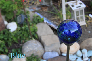
           I describe myself as the color blue. Blue is a reserved color, just like me. When people first me, I am super shy and seemgly unfriendly. But as you get to know me, you start to see the different sides of me or hues, if you will. Lighter versions of blue represent a sweeter, big sister-like side of me. The darker you go, the wilder or crazier I get and only really close friends have seen this side of me. The darkest this color goes represents the side of me that is super serious and fiercer side that sees something she wants and goes for it.

Assignment #6: How do you See Polar Opposites?

Image
Black and White          When I started brainstorming ideas for this concept, I had a lot of other options. But in the end, this concept of black and white hands really spoke to me (the deadline spoke to me too).  But I really dug this concept. My original idea was to just paint the hands and have it under the contrasting color background. That evolved to having the contrasting color drip down the hand. Putting these photos in lightroom allowed me to intensify colors and clarity which brought my idea to reality and I am really happy about it.  

Sketchbook #3: Folded Laundry (now revised)

Image
Thanks for commenting on my last one, Mrs. Kuntz! For my revision, I took it at a time where there was more light available. I also changed the composition (this one I really like). And I decided to keep it in color. 

Assignment #5: Texture 101

Image
My Photos:  Technical: Exposure- 1/320 sec    F Stop: f/8  ISO: 800 Technical: Exposure:1/320 sec     F Stop: f/8   ISO: 100 Technical: Exposure: 1/320 sec    F Stop: f/8  ISO: 800 Technical: Exposure: 1/320 sec    F Stop: f/8  ISO: 100 Online:  by, Scott A. McDaniel I like this photo because I can see all the ice on the chain- from the tiny ball-looking ones to the sharp icicle looking ones. The clarity of the chain and ice looks really good and pleasing to the eye against the green, blurry background. I also like the light and brightness of this photo.

Assignment #4: Composition

Image
Leading Lines: Diagonal Lines (best): I think this is one of the best because of the lighting. I really like how you can see the source of the light and how it reflects on the ground. In addition, the diagonal lines lead you to the subject clearly.   Texture (best):  One reason I think this picture is one of the best is because you can clearly see the texture of the tree. Also, those lines, as well as that of the actual trunk serve as a diagonal leading line leading the eye to the end of the tree. Lastly, the color of the tree trunk and branches contrasts with the sky.  Framing (best): I think this picture is one of the best because of the shape of the "frame". Also, the contrast of light in the "frame" and what's in the distance is really nice. Lastly, I like all the leading and diagonal lines in the picture that lead the eyes all around it.   Rule of Thirds: 

Sketchbook #2: Glass of Water

Image
the main one: Here's just another one with different colors :)

Assignment #3- ISO, F Stop, and Shutter Speed

Image
Assignment #3

Assignment #2: What's a "Selfie" without an image of "Self"?

Image

Sketchbook #1: Old Shoes

Image